
About the BCM Time Series Graph Tool
Short Video Tutorials with Lorrie Flint
|
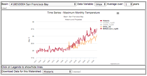
The California Climate and Hydrology Change Graphs tool summarizes climate and hydrology changes over time by watershed using historical and projected data. For each of 156 "HUC-8" basins (watersheds) in "hydrologic California", it can plot the values of a user-selected data variable (like precipitation or max temperature) over time, with a selected amount of multi-year averaging to smooth out the year to year irregularities. The resulting graphs can be used to explore the data or grabbed with a screen-shot and used in a report. The per-basin data underlying the charts can also be downloaded, and more graphs and plots can then be made using a desktop application such as Excel. |
About the data source
The graphs are made using the downscaled climate and hydrology (water balance) data produced with the USGS California Basin Characterization Model (2014 version). This dataset has been widely used for research and planning in California because it has spatial and temporal resolution high enough to provide meaningful assessment of change within relatively small geographic areas such as counties, state parks, and wildlife refuges. It's called the "Basin Characterization" model because it provides a holistic assessment of the fate of water in a drainage basin. Water movement and availability are primary drivers of biodiversity and human activities, and thus the model has many uses in conservation and socioeconomic management. The model outputs used here are the 2014 version.
The California Basin Characterization Model (CA BCM) combines downscaled climate data (temperature and precipitation) with modeling of hydrological processes to produce additional downscaled layers for a complete set of water balance fractions: runoff, evapo-transpiration (both actual and potential and their difference, called Climatic Water Deficit), recharge, and soil storage. Each of those model outputs is called a "Data Variable" and these form the BCM's geodata layers with values for every raster cell at a spatial grid size of 270m x 270m, approximately 18 acres. The Climate Commons has more information about both the full month-by-month CA BCM Data hosted by the USGS, and the summary set of derived 30 year averages hosted on the Commons. The time series graphs in this tool were produced from the more extensive monthly dataset, which is too large for most people to access and use. Read more here about the California Basin Characterization Model and its many applications.
About the data variables
You can select a Data Variable to plot using a pull-down menu near the top of the charts. For an explanation of the meaning of the data variables, see the list at the bottom of this page for a list of BCM data variable names and abbreviations; you can click for a more detailed description. Listen to Lorrie Flint explain the data variables more in this video: About the Data Variables (3.5 minutes).
About the basins
The charts and underlying data in this tool are organized by drainage basins (a land-area delineation analogous to watersheds) defined in the Watershed Boundary Dataset, which is a nested set of polygons produced by the USGS. You can select a basin using a pull-down menu near the top of the charts. We have provided data for 166 mid-sized basins in hydrologic California, in particular at the level described by 8 digit Hydrologic Unit Codes, ie: HUC-8. You can download the basin polygons we used.
If you need total water volumes, you can get the area of each basin from those shapefiles, and multiply by the desired data variable in mm H20 (in the downloaded spreadsheet for that basin) to get volume (with the appropriate conversion factor for your desired output units).
About the smoothing options in the tool (moving averages):
Annual climate related data tends to be very "noisy" as shorter-term weather jumps around a lot, both in the recorded historic data and the projected future values. Sometimes it is useful to plot the annual values, to get a visual sense of how the values vary - the extremes, the ranges, and the variability - although for future years you have to be careful to remember that projections do not intend to predict any given year, only estimate the overall pattern or distribution.
However, sometimes we are more interested in multi-year trends and the jagged annual data makes that harder to discern. So the tool provides the option of smoothing the data using a simple moving average (sometimes called a running average), which for any given year plots the average of multiple years ending that specific year. So for example, with a 15-year moving average window, to get the value to plot for any given year we would average that year with the previous 14 years. You have a choice of several window widths in the pull-down menu labeled "Average over".
Larger (longer) averaging windows do more smoothing by averaging more values; this tends to show the longer-term trends otherwise masked by short term variability. Choosing a window of 1 year simply plots the annual data with no multi-year moving average. We plot the average in the middle of the window so that peaks and valleys are not time shifted depending on the window width. Note that with a moving average window greater than one, we cannot plot averaged values the first few years (on the left) until that number of years have elapsed.
You can download the data to do other analyses in your desktop application.
How we made the data tables:
The "raw" BCM Dataset includes month-by-month values for the historic time period and for several projected future climate scenarios, in a raster format, with 270m x 270m raster cells. This raster was intersected with the watershed polygons and the pixels in each watershed were averaged, providing one value per polygon per month; and this data was further combined to provide annual values for plotting in the tool. There were many terabytes of original raster data which had to be intersected with the watershed polygons, to produce much smaller per-watershed annual summary data, for each of several data variables. You could do this yourself using the raw monthly raster data hosted by the USGS. We used a script in the R statistical language (written by Sam Veloz and associates at Point Blue Conservation Science), which we will share in the future (however, it took a long time, in calendar terms, to run this script). If you are interested, please let us know!
About the future projections chosen for the graphs
The 2014 California BCM was calculated for 18 projected future climate scenarios (also called climate models, a combination of GCM and emissions projection), but for most applications only a few need be used to give an idea about possible future trends. To keep this simple to visualize and understand, we have chosen 4 future projections which fairly well represent the range of variation among those 18. You can click on the legends at the bottom to hide or show a given future projection.
The four projections used in the graphs were made with these scenarios: GFDL A2, CNRM RCP 8.5, CCSM4 RCP8.5, and MIROC RCP 8.5. These were chosen from the larger set of 18 because they represent the range of variability in the scenarios that are considered "worst case" due to the higher greenhouse gas emission projections used. These show a range of potential futures from the CMIP5, using the "hottest/driest" (MIROC RCP 8.5), one of the "wettest" (CNRM RCP 8.5), a model that falls toward the middle of the pack (CCSM4 RCP 8.5), and a commonly-used model from CMIP3 (GFDL A2) for comparison with older studies. This article talks about these models and has a graphic comparing these four with the entire set of 18 along with historic data. Listen to Lorrie Flint explain the future projections in this short video: About the Future Scenarios (2 minutes).
About the authors:
This handy tool is brought to you by Doug Moody at Point Blue Conservation Science, and Zhahai Stewart and Deanne DiPietro at the CA LCC. The California BCM Dataset was developed by Lorraine and Alan Flint of the USGS Water Science Center, and produced by Ryan Boynton and Jim Thorne at UC Davis.
How to cite:
If you use the graphs or data in your plan or report, please cite the source. Here are suggested citations:
For the graphs straight from the web page:
Source of time series graphs: "California Climate and Hydrology Change Graphs", United States Geological Survey, California Landscape Conservation Cooperative, Point Blue Conservation Science. Accessed (date) from the Climate Commons at http://climate.calcommons.org/article/ca-bcm-time-series-graphs.
For the use of the downloaded data:
Data source: 2014 California Basin Characterization Dataset time series extracts by HUC 8 basin. United States Geological Survey, California Landscape Conservation Cooperative, Point Blue Conservation Science. Accessed (date) from the Climate Commons at http://climate.calcommons.org/article/ca-bcm-time-series-graphs.
1/2016